GIF and History of Architecture

“It’s Alive” by iHeartBerlin (editor-in-chief Frank R. Schröder) made in 2011 for the online exhibition GIF. ME. BERLIN. features Bierpinsel (beer brush) tower restaurant in Berlin. One of the most recognisable brutalist landmarks in Germany was built in 1976 by architects Ursula and Ralph Schuler. It was painted in 2010 by several artists on the occasion of the restaurant’s reopening


TRAILER by Joseph Henry Kennedy Jr. is independent research which was published in [TRANS-] journal 2017. Excerpt from the text: “For many low income working class families, living on the road is no vacation. The subject of many negative stereotypes, a significant portion of the American population live in dingy trailer parks and cheap mobile homes. Within the constraints of a bounding box dictated by road lane widths, bridge overpass heights, and turning radiuses, the exterior form of each trailer takes on different characteristics arrangement and adjacencies between the programs contained within its rigid shell. By combining elements of architecture, furniture and automotive design the transient shelters attempt to optimize space, reduce weight and lower costs while providing a customizable options suited to the varying needs of consumers.
This research project unpacks and categorizes the different organizational strategies that are applied to compact domestic functions into the narrow enclosures of the generic trailer homes in order to speculate on methods to integrate these independent units into the urban fabric of the modern American city by considering the variety of trailer parks that exist in within the limits of Mesa Arizona.”
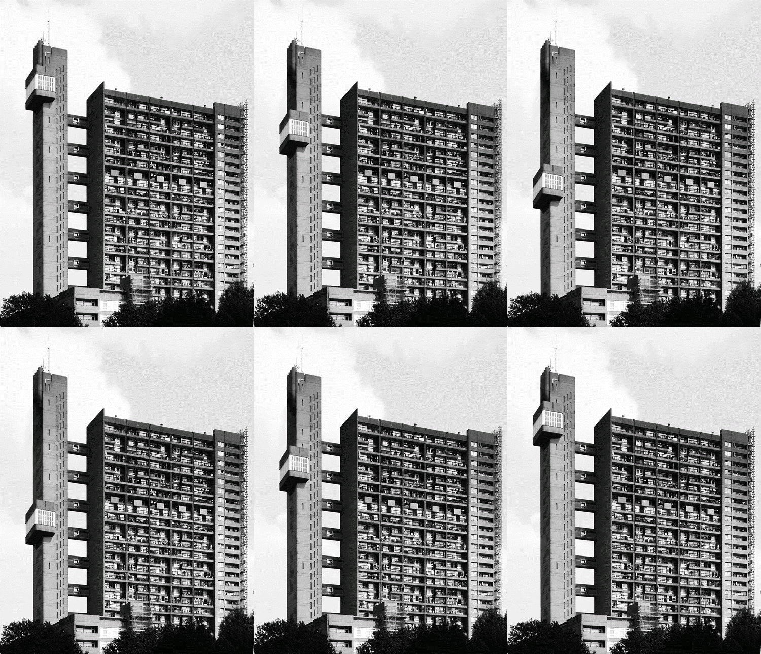

Digital art exhibition, Art. Gif Västermalmsgallerian, curated by Young Art (Stockholm 17/11-2/12/2015) featured twelve artists, including Greta Larkins [left] who animated London’s Trellick tower (architect Erno Goldfinger, 1963-67). This exhibition was the first one entirely dedicated to GIF art in Sweden. After the closing, the art works were auctioned by Tradera, relating the subject of how digital art can be owned and how it enters into discourse of the art world. Above is short insert from Gorillaz’ video for Sleeping Powder which features Trellick tower

Nakagin Capsule Tower in Tokyo, Japan (architect Kisho Kurokawa, 1970-72) is one of the most iconic buildings in the world. It is composed of repeated, multiplied and detachable modular capsules-apartments, 140 in total, each being initially equipped with Sony electronic components. The building is nowadays in quite damaged state and some of the capsules are being bided by museums and private collectors, as the building might be demolished. Images of interior are from photo project “1972” by Norikata Minami

Léna Douani designed visual identity for the Habitat 67 in Montreal (architect Moshe Safdie), edition UQAM, Montréal, 2014

Designer Sergey Lisovsky has created an online illustrative magazine Pattern Brutalist and its first issue was published in January 2017, illustrating Brutalist buildings dating between 1968 and 1980. Lisovsky created a collection of GIFs from photographs and illustrations of the featured sites
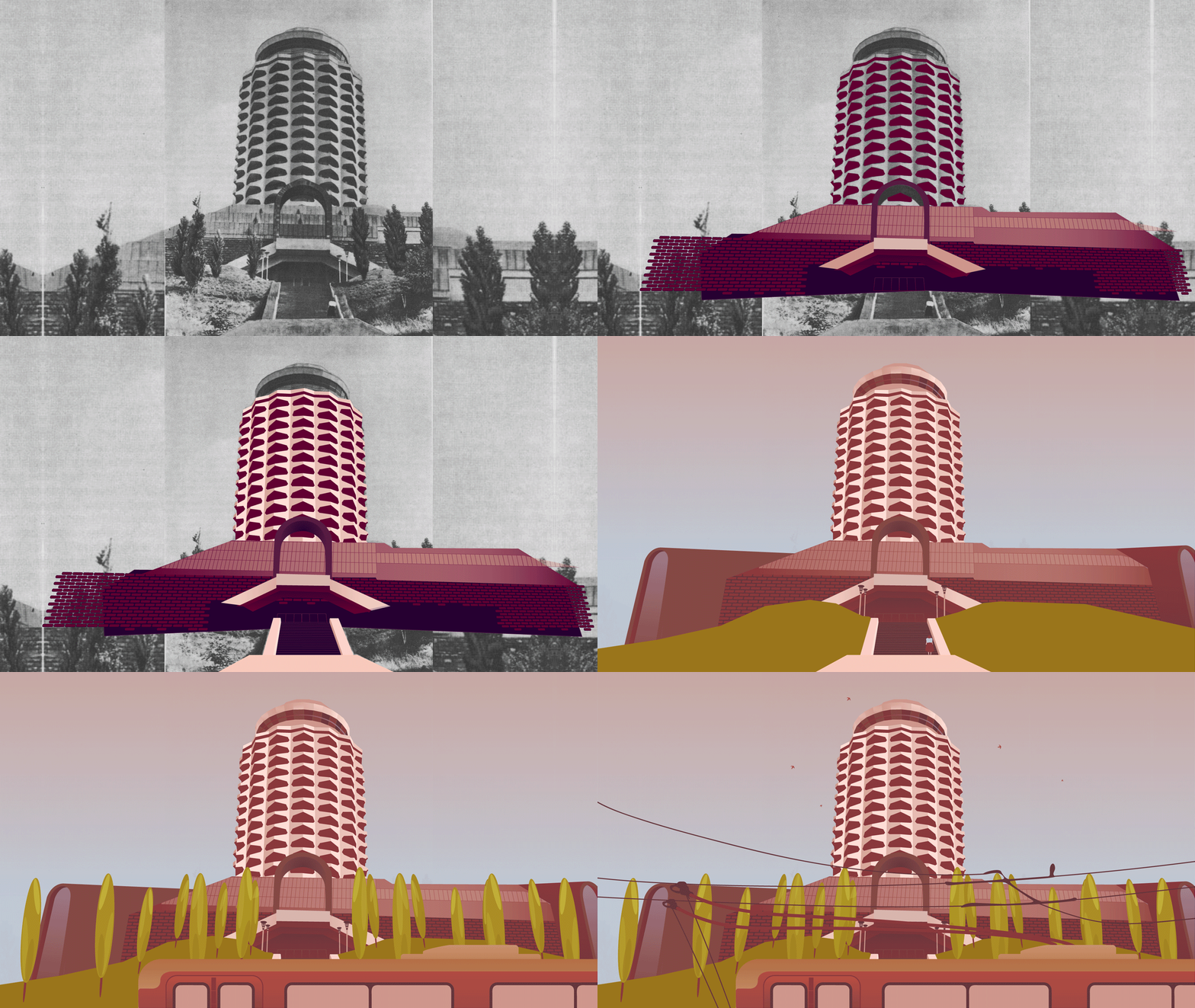
Youth Palace in Yerevan (architects A. Tarkhanyan, G. Poghosyan, S. Khachikyan and M. Zaqaryan) was constructed by the end of 1960s and demolished in 2006 to make a space for a five star hotel. This GIF is from a series Soviet Modernism in Yerevan by Nineveh Khachatryan, Tigran Movsisyan and Hakob Gapenyan
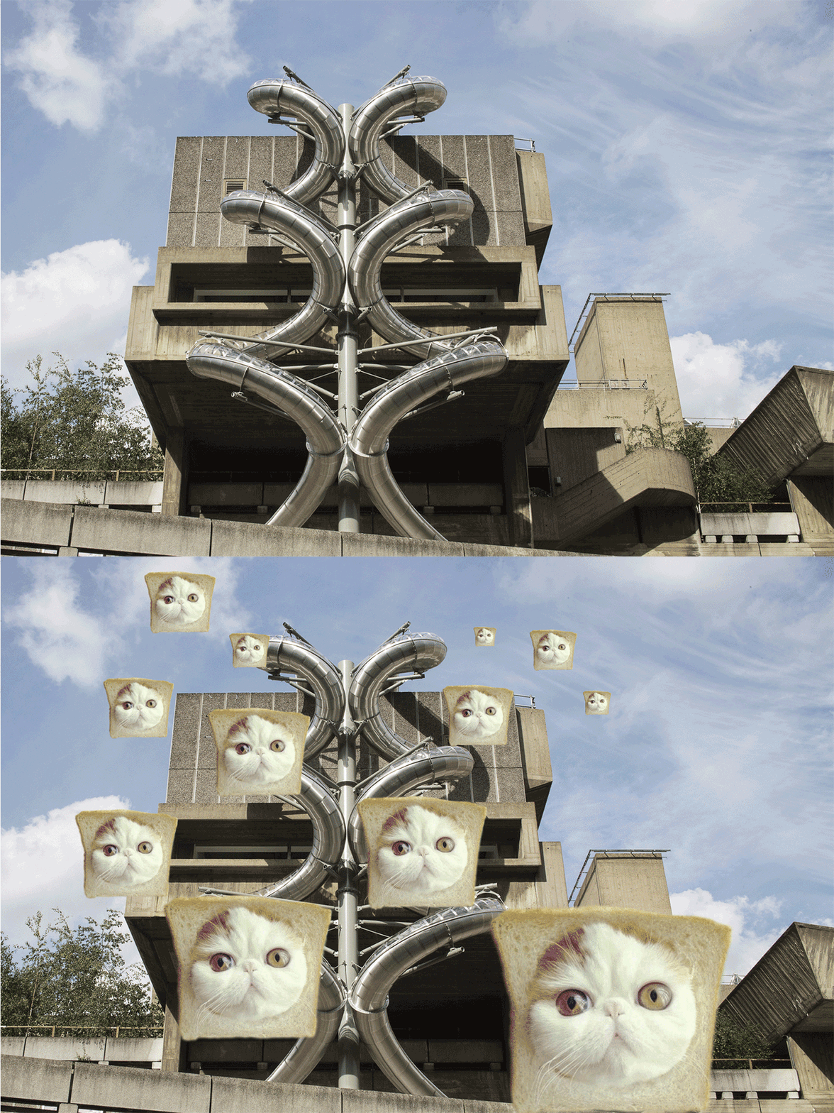
Isomeric Slides by Carsten Höller during installation of ‘Decision’ at Hayward Gallery, London (10/6-6/9/2015). The Gallery was designed by architects Norman Engleback, Ron Herron, Warren Chalk and John Attenborough in 1968. Photography by David Levene, image courtesy the artist and LUMA Foundation
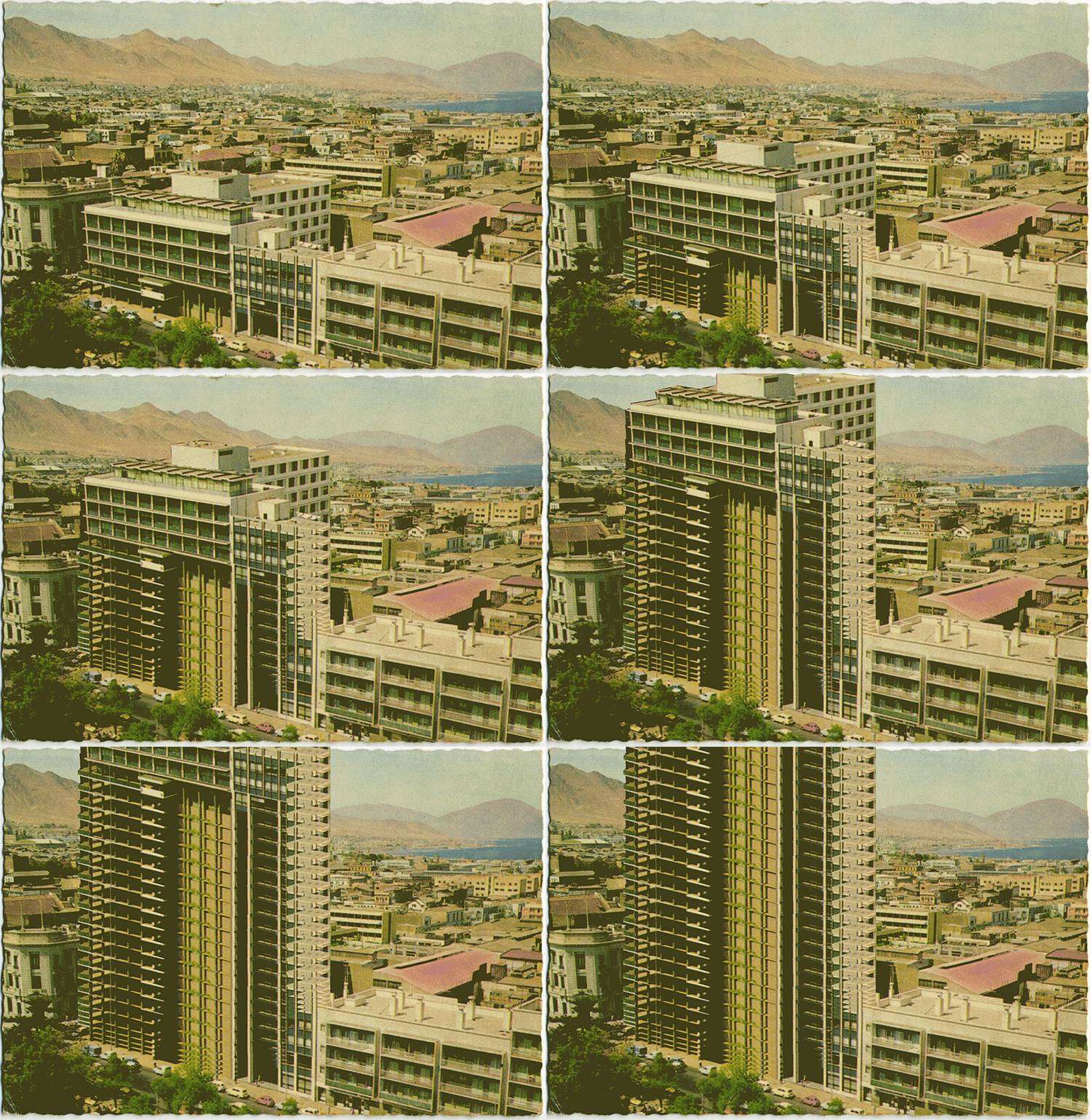
Animated GIF made by Claudio Galeno in 2015, from aerial postcard of the modern center of Antofagasta, Chile
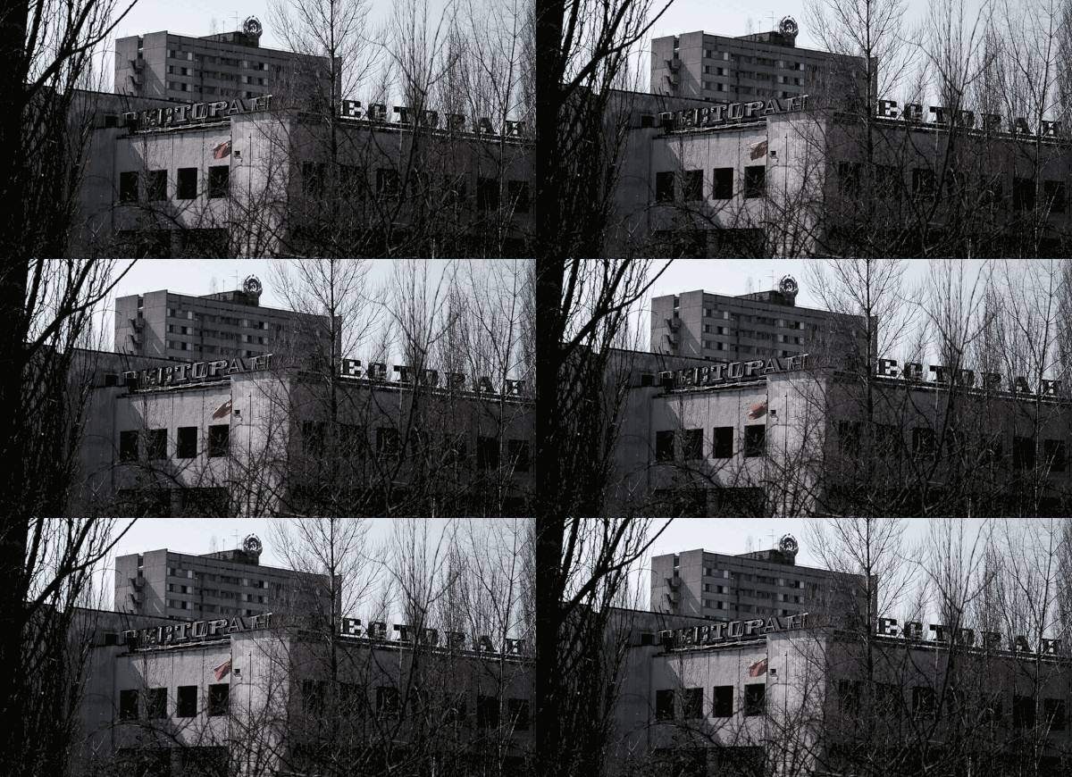
Chernobyl aftermath by Christiaan Welzel
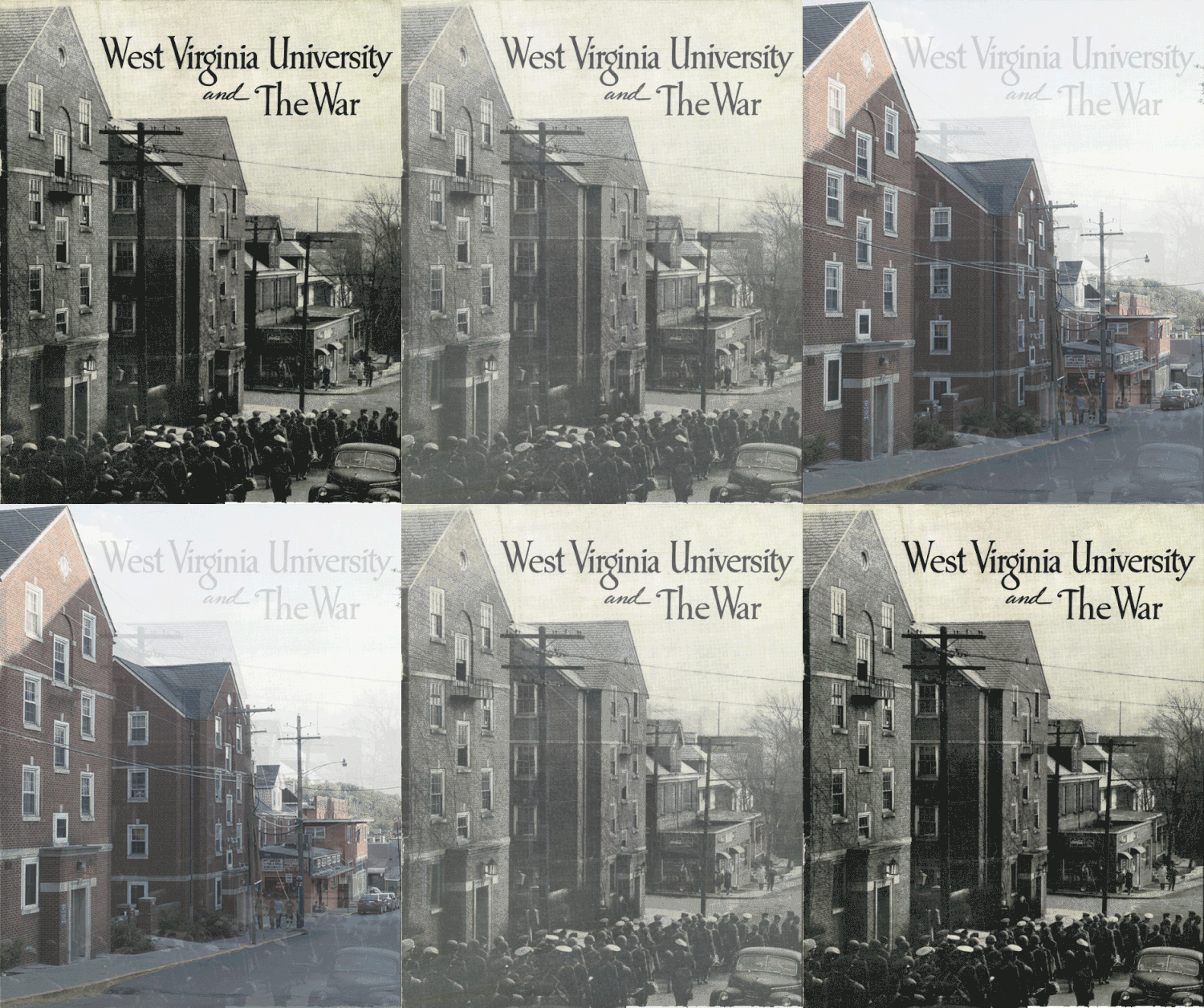
Historic GIFs Project by Chris Dale depicts archive photographs of Morgantown, West Virgnia, and the same locations from today’s perspective. The largest segment of the project focuses on period between the two World Wars. Selected GIF presents soldiers/students marching down University Avenue to the train depot for World War II on March 30, 1944

[left] The City of Perth experienced a major building renaissance, beginning in the 1960s and into the 1970s, due to the discovery and subsequent mining of iron ore in the north west of Western Australia. With the sudden increase of the population a significant changes were seen in the city skyline. The Demolished Icons of Perth project showcases the history of the buildings that were destroyed and subsequently what now stands in their place. Most were demolished between 1960 to 1980, although some historic buildings remain intact. The GIF presents Herbert Moir’s Chambers, built in 1897 and demolished in 1960. “While T & G Chambers was widely acknowledged as one of the most beautiful buildings in Perth, the company’s growth dictated its demolition and replacement with a modern, 18-storey building which better served its needs. In early 1960, in the face of early civil protest, the Chambers was demolished and replaced by the tallest building in Perth until 1970.”
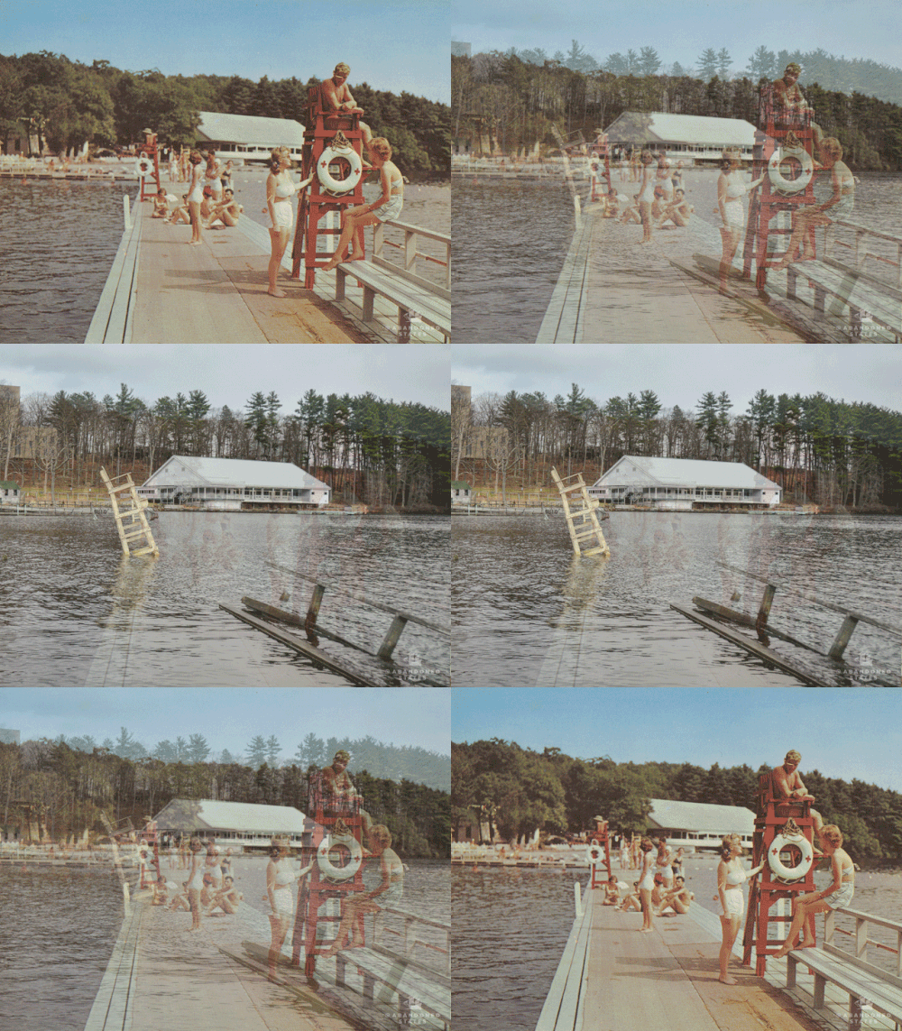
[right] Pablo Iglesias Maurer’s photo series Abandoned States have been created during three years. Following the postcards from 1960s which were made at the most representative states of resorts in vacation towns in the Poconos and Catskills mountain range, Maurer documented today’s state of resorts such as Pennsylvania’s Penn Hills and New York’s Grossinger and Homowack
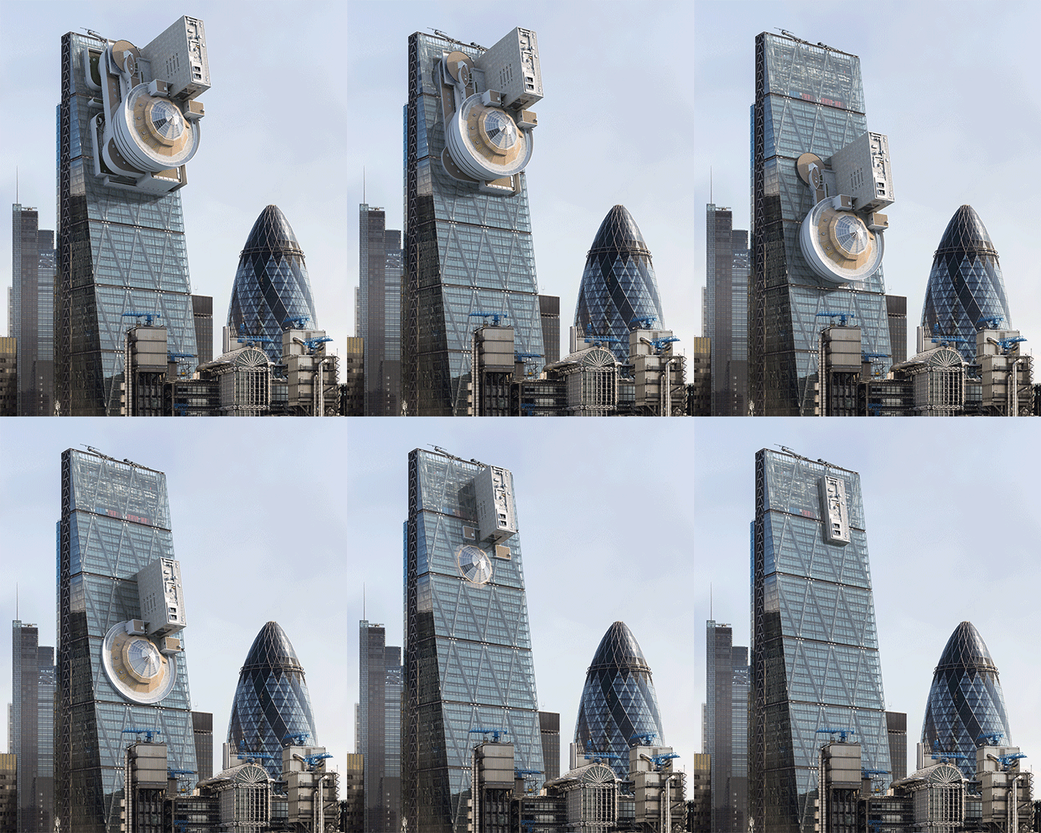

[left] In his work Artgrater (2016) Víctor Enrich focuses on the ‘end of art,’ criticising “the ways in which money, particularly large sums of it, has destroyed the art world - forcing many of today’s creatives to engage in ‘what sells’, rather than their own experimentation.” For that reason he chooses to ground New York’s Guggenheim Museum (architect Frank Lloyd Wright, 1952) down London’s Leadenhall building, commonly known as the ‘Cheesegrater’ (arch. Roger Harbour, 2014) and through symbolic significance of these two buildings, he illustrates to which extent is money powerful over creativity which is in this case destroyed beyond repair, as the building of Guggenheim museum.
Source: Nina Azzarello, Designboom, dec 19, 2016
[right] Ester Piscore, Inserciones en el Edificio España de Madrid: Fuller, Amid09, Mathew Borrett, Gaudí, Büro Ole Scheeren, Jorn Utzon, Andrew K. Green, Nick Elias, Koolhaas
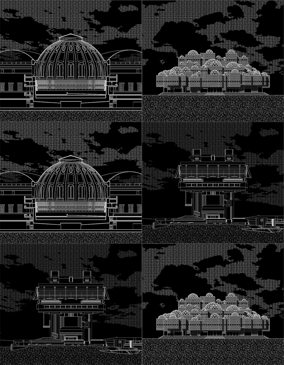

Research-led exhibition Icons of Knowledge: Architecture and Symbolism in National Libraries at the Harvard Graduate School of Design (2/2-22/3/2015) examined why national libraries are amongst the most symbolic icons of modern day countries and "dominated by nationalistic ambitions and overwhelming architectural details.” It was curated by Noam Dvir and Daniel Rauchwerger after a four-year research, and designed by Benjamin Albrecht and a student exhibition team.
The image shows plans of the Saudi Arabian King Fahad National Library (Riyadh), the Belarus National Library (Minsk), The Library of Congress (Washington DC), the Biblioteca Nacional de España (Madrid), Reading Room (Paris) and National Libraries in North Korea and China.

Peristil is the central square of Diocletian’s palace which after the fall of the Roman Empire became the city Split in Croatia. The GIF illustrates (guerrilla) art interventions that took place on the square during which it became red, yellow or green. On 10/1/1967, several students at their early 20s coloured the square in red as a sigh of the protest against the regime and were later seriously prosecuted for this. The intervention was visible only for a couple of hours, but luckily it was documented. On 19/11/2009, unknown activists covered the square completely by yellow PVC and used the same font used by the monopolising supermall to print “Kodeks” as a sign that the city of Split was capitalised and monopolised. On 26/10/2015 took the action “Green Peristil” organised by the green movement of the city which covered the square with artificial grass for one day. Read more about it in article Peristil, place and space of ideologies for Vizkultura, published on 1/11/2015. GIF by Vizkultura

The Croatian Pavilion at the 14th International Architecture Exhibition – la Biennale di Venezia
Fitting Abstraction exhibits fundamental attributes of Croatian architecture culture that persist as decisive qualities throughout the hundred year period. It thus demonstrates the ways in which modernism reinforced an existing design culture that extended its historical trajectories up to the present day.
Curatorial Team: Karin Šerman (Commissioner and Curator), Igor Ekštajn (Deputy Curator), Nataša Jakšić, Zrinka Barišić Marenić, Melita Čavlović, Mojca SmodeCvitanović, Marina Smokvina / Organisation and Deputy Commissioner: Sanja Cvjetko Jeković / Research and Content Production: Marija Barović, Ana Bedenko, Mislav Kuzmanić / Collaborators: Nikola Brlek, Aleksandar Matijašević, Marko Mihaljević, Dino Mišković, Karlo Seitz, Matija Solomun, Sven Sorić, Hrvoje Spudić / Exhibition Design: Simon Morasi Piperčić, Kristina Jeren, Igor Ekštajn / Graphic Design: Đukićpavlović

Renzo Piano's sketches, edited by ArchDaily

Plan diagrams of Berlin Free University by Candilis, Josic, Woods and Schiedhelm


[left] The Farnsworth House, Ludwig Mies van der Rohe, 1945-51, unknown author of animation
[right] Ville Savoye, Le Corbusier, 1928/1931, from Iconic Houses by Matteo Muci


[left] Spaceship Earth, a 18-story geodesic sphere, 1979-1982. The structure is similar in texture to the United States pavilion from Expo 67 in Montreal, except that Spaceship Earth is a complete sphere, supported by three pairs of legs. The architectural design was conceived by Wallace Floyd Design Group, while the structural designs of both Expo 67 and Spaceship Earth were completed by Simpson Gumpertz & Heger Inc. of Boston, Massachusetts. It took 26 months to be completed. Geometrically, Spaceship Earth is a derivative of a pentakis dodecahedron, with each of the 60 isosceles triangle faces divided into 16 smaller triangles (with a bit of fudging to make it rounder). Each of those 960 flat panels is sub-divided into four triangles, each of which is divided into three isosceles triangles to form each point.
[right] Buckminster Fuller, Network Patterns, Storefront for Art and Architecture, New York


[left] Roman Market Gate of Miletus at the Pergamon Museum in Berlin, unknown author
[right] Heritage of Egyptian architect Hassan Fathy came into focus when Google lunched this animated GIF on March 21, 2017, which would have been his 117th birthday. Fathy's contribution for world architecture is in his invention of passive buildings that are suitable for specific climatic conditions and beneficial for public health. His architecture is referential of the ancient structural massing and traditional Nubian vault, while its construction employs ancient craft skills. Fathy incorporated dense brick walls and traditional courtyard forms to provide passive cooling
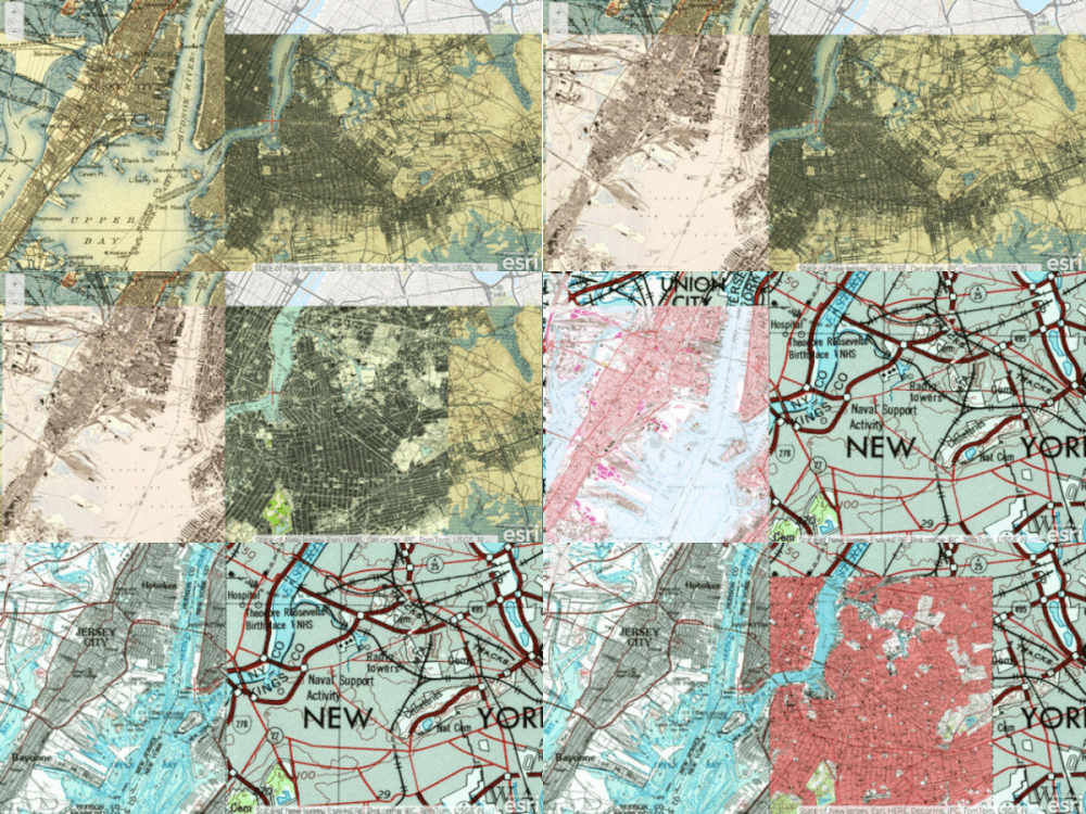

[left] Since the beginning of 2014, the USGS Historical Topographic Map Explorer enables insight into over 178,000 old maps of the USA, some dating all the way back to 1884, while an application allows mixing and matching any of them. Once a viewer selects a geographic area (a city, a landmark, an address, etc.), a slider appears showing all the map options to view, arranged along a timeline. Selecting these maps will position them perfectly over a present-day map, and it is also possible to layer them in preferred order and to control their transparency. One can also watch how a map changes focus through years, from simply plotting parcels to including railroad routes and eventually freeways. Depending on a particular area, the detail from the maps can show, for example, lakes that were in place of streets or city parks.
[right] historic maps of Amsterdam
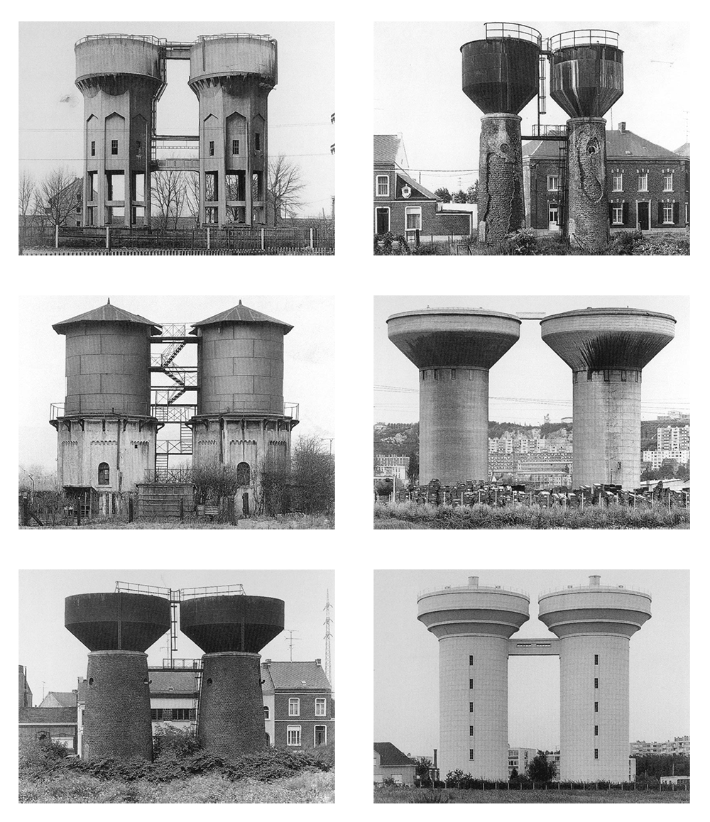
Bernd and Hilla Becher, Industrial typology: Census, water towers of any type, via The Energy Issue. The animation is also an example of presentation of collection of photographs which is enabled by typography studied by Bechers.

Cubes: Kaa’ba, Mecca, undefined; Palazzo della Civilta Italiana, Giovanni Guerrini, Rome 1939; Modena Cemetery, Aldo Rossi, Modena, 1971; School of Management and Design, Sanaa, Zollverein 2006
Geodesic domes: Etienne Louis Boulee, Newtwon Cenotaph, Chaux, c 1785; Haus des Gaertners, Claude Nicholas Ledoux, Chaux, c 1789; Spaceship Earth, Walt Disney Imagineering, Orlando, 1983; RAK Convention and Exhibition Centre, OMA, Dubai 2008
Pyramids: Kefren Tomb, IV Dinasty, Giza, 2694-2563 BC; Pyramid of Cestius, Giambattista Piranesi, Rome, c 1747; Palace of Peace and Reconciliation, Foster + Partners, Astana, 2006; Le projet triangle, Herzog & De Meuron, Paris 2008
From The Manifesto of Hardcorism by WAI Architecture Think Tank (Nathalie Frankowski & Cruz Garcia)
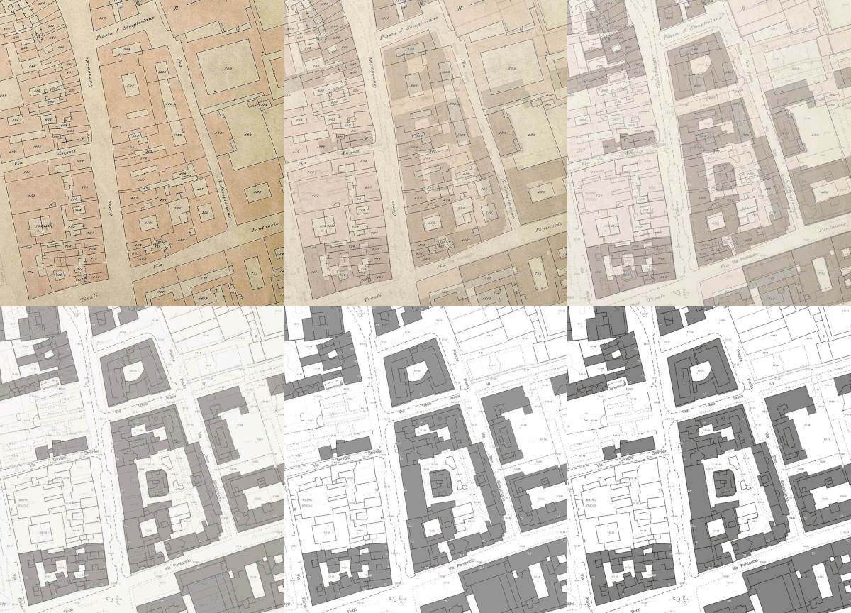
[left] Milan, the Municipal Technical map of 1910 and 1930, and today
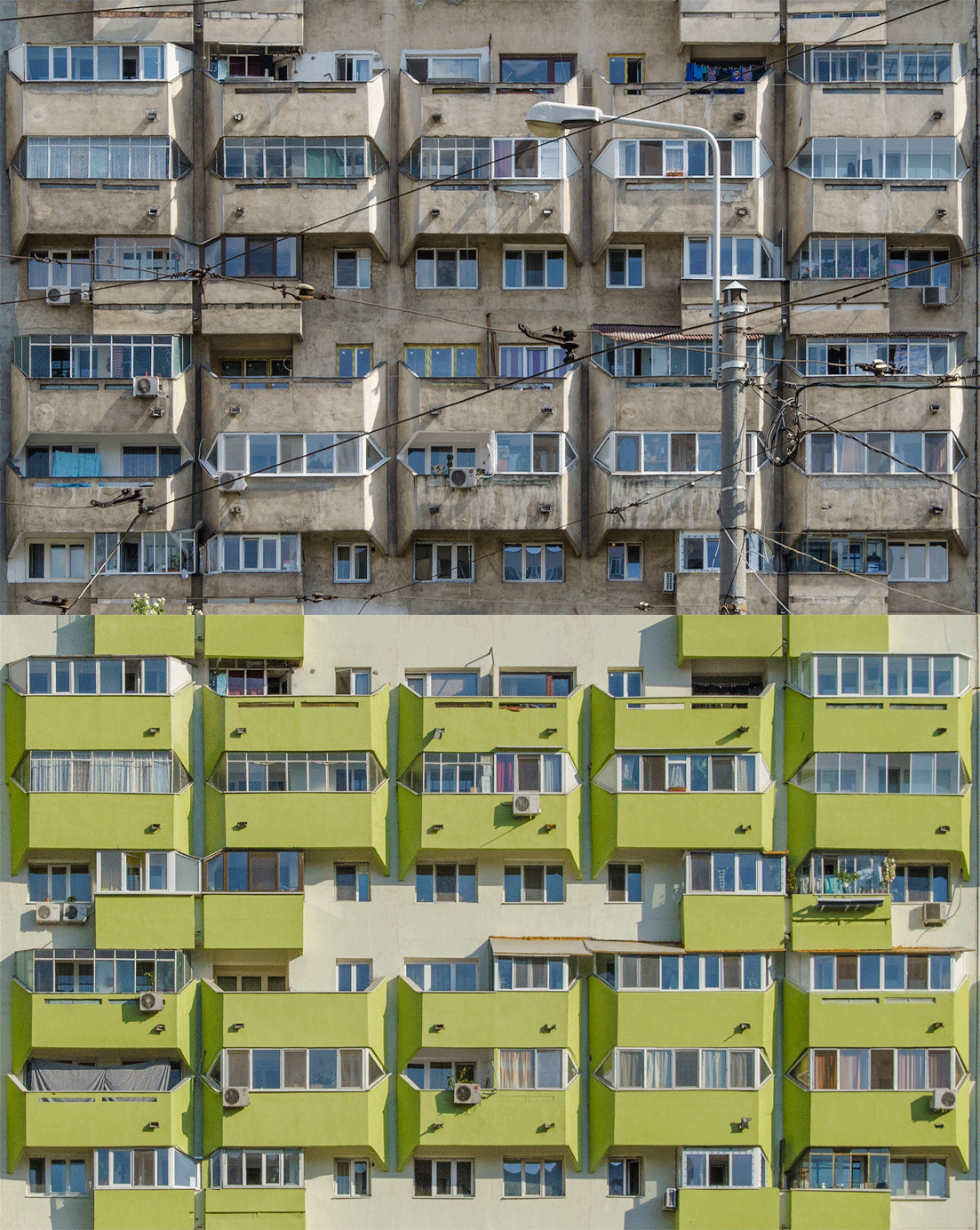
[right] Housing building on Chisinau boulevard in Bucharest, Romania, built between 1976-78. Architect: Gheorghe Nădrag (et al) Proiect Bucuresti. The GIF presents its original state and colours after isolation

[left] Luis Barragá, Las Arboledas ranch, Mexico City 1962
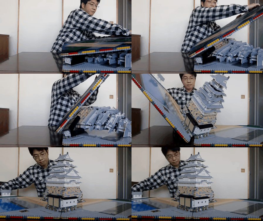
[above] Talapz created a pop-up LEGO version of Japan’s Himeji Castle which took him 15 months to build and weighs about 27 pounds. Himeji Castle is a hilltop caste complex in the Hyōgo Prefecture of Japan. Dating back Japan’s Feudal period, many consider the castle to be the finest surviving example of early Japanese castle architecture

Analysis of Salk Lake Institute, Louis Kahn, 1965
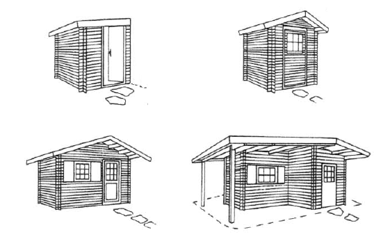
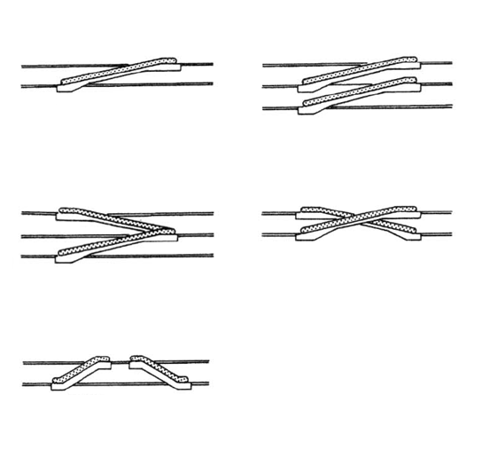


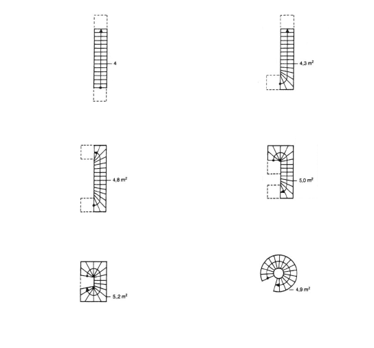

NEUFERT GIFs by Salomé Bernhard, following "Les éléments des projets de construction" by Ernst Neufert. Images above are animated illustrations from pages 233, 208, 59, 180, 176, 163.
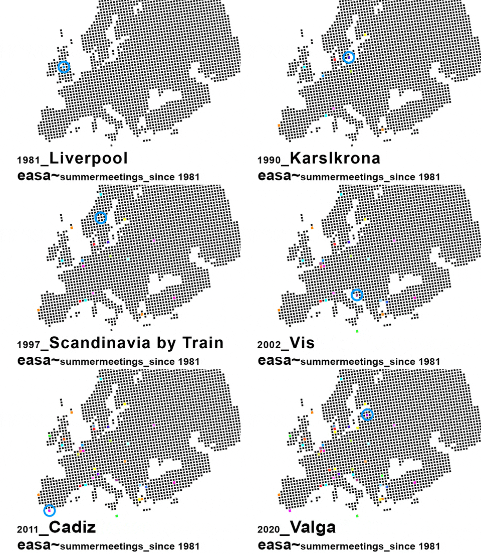
EASA - European Architecture Students Assembly since 1981, GIF by Caz
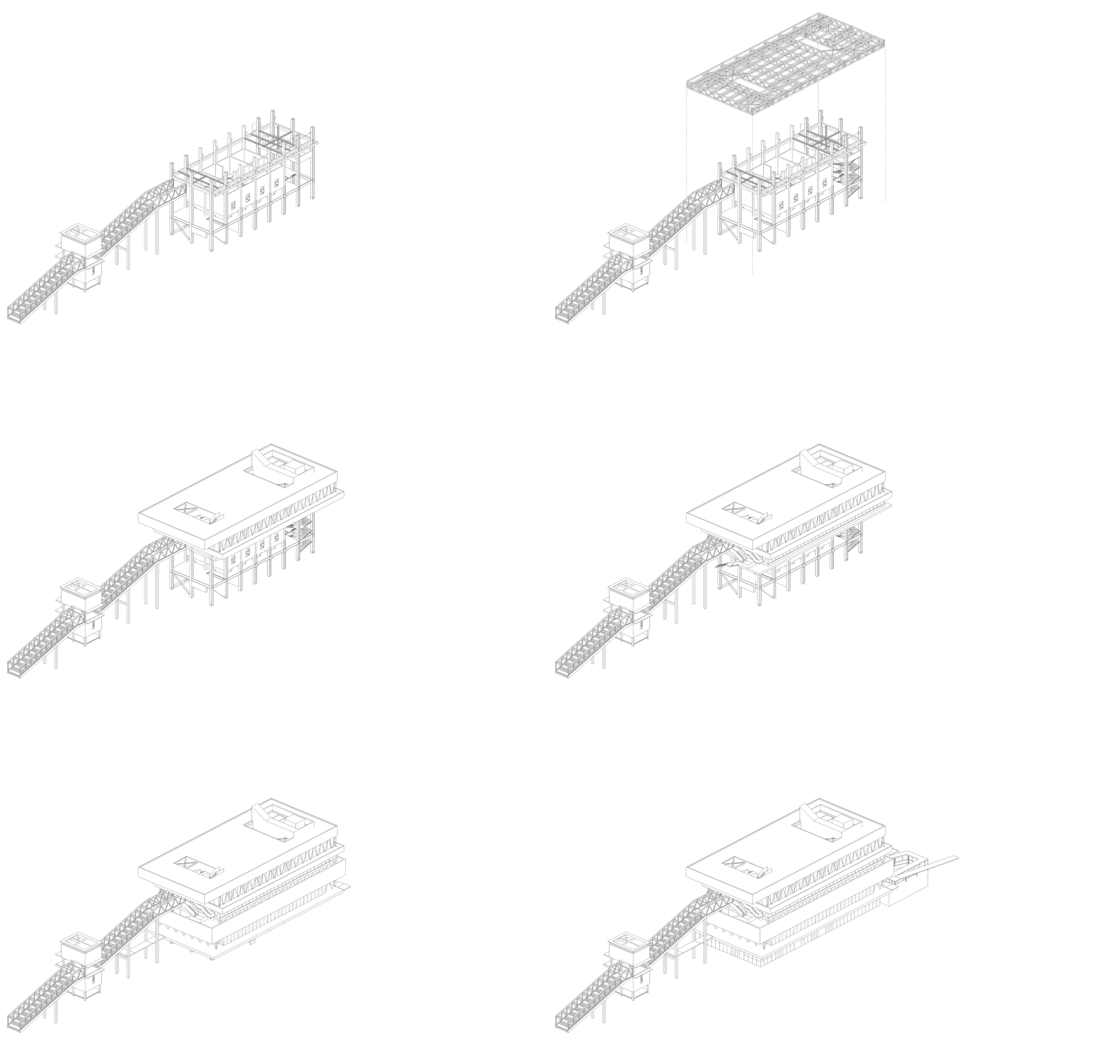
Shanghai Modern Art Museum
Atelier Deshaus, 2016, 9180m2
The Laobaidu coal bunker transformation, which began before 2015, was faced with the fate of demolition. Fortunately, in 2015, the first session of Shanghai Urban Spatial Art Festival set here a case study sub-exhibition space which theme was set by its curator, Lu Feng and Yichun Liu as the transformation and reuse of industrial buildings. Since then, the property owner of the coal bunker and its future gallery party sensed the possibility and strength of the combination of crude industrial architecture façade and exhibit space, willingly accepted the transformation principle of keeping the main space and structure of the bunker, and named it ‘Modern Art gallery’. The project effectively combines the public function of gallery and the original industrial ruins, and provides extremely high flexibility to the public space while fulfills the interior function request of the gallery, which brings new possibilities to the gallery’s new age operation.
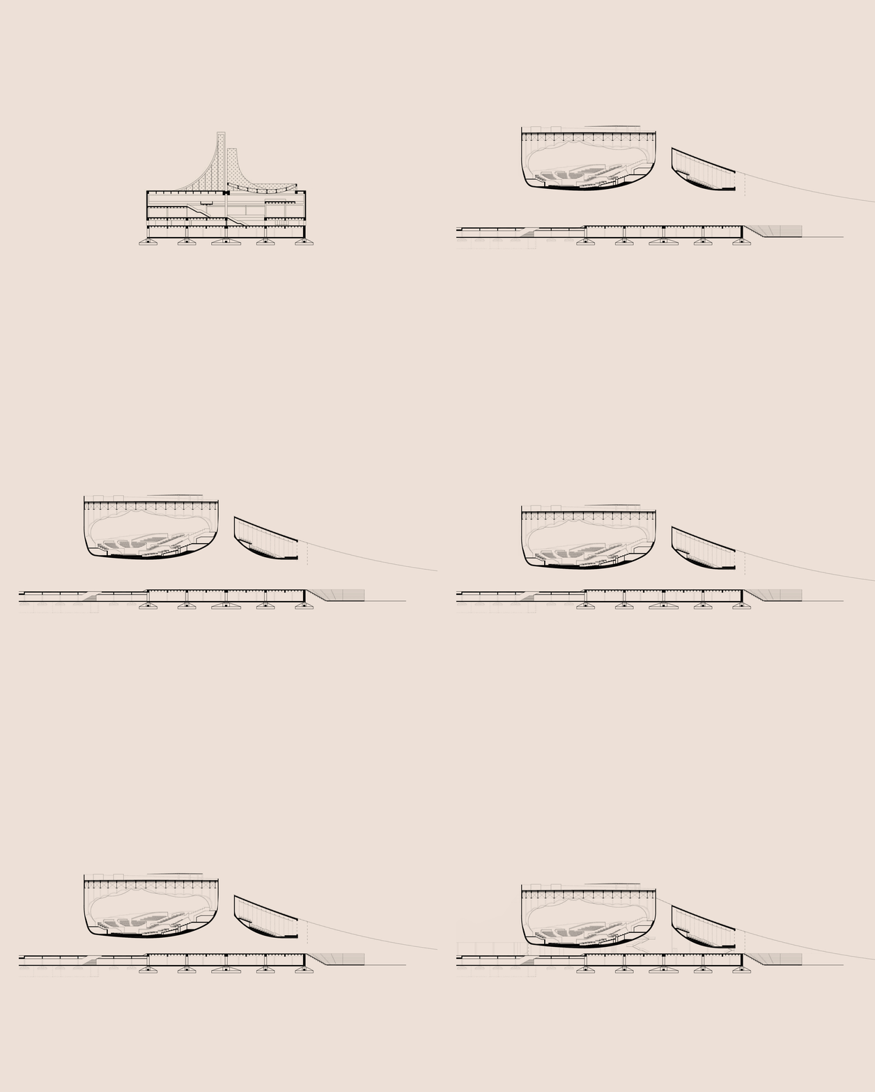
Ljubica Arsić
Project proposal for the Block 13 – Belgrade Philharmonic Hall, 2016, Belgrade, Serbia
Credits
Authors: MADA, Bach-Mühle-Fuchs, Aleksandra Bogdanović, Ljubica Arsić and Lara Mehling, landscape architect
The project follows Vjecenslav Richter’s proposal for the Museum of Yugoslav People’s Revolution that had been started, but never finished on that location.

Budapest Architecture Film Days, 2019
Régen minden jobb volt? A belgrádi Hotel Jugoslavija a múltban és a jövőben (=Kempinski).
Hotel Jugoslavija (CH), 2017 78'
Március 9, szombat 21:00, Toldi
Has everything been better before? Hotel Jugoslavija in the city of Belgrade and in the past & future (=Kempinski).

One of the most recognisable structures in Belgrade - splav - the boat-club that has been proliferating on banks of rivers. Unknown author of the GIF
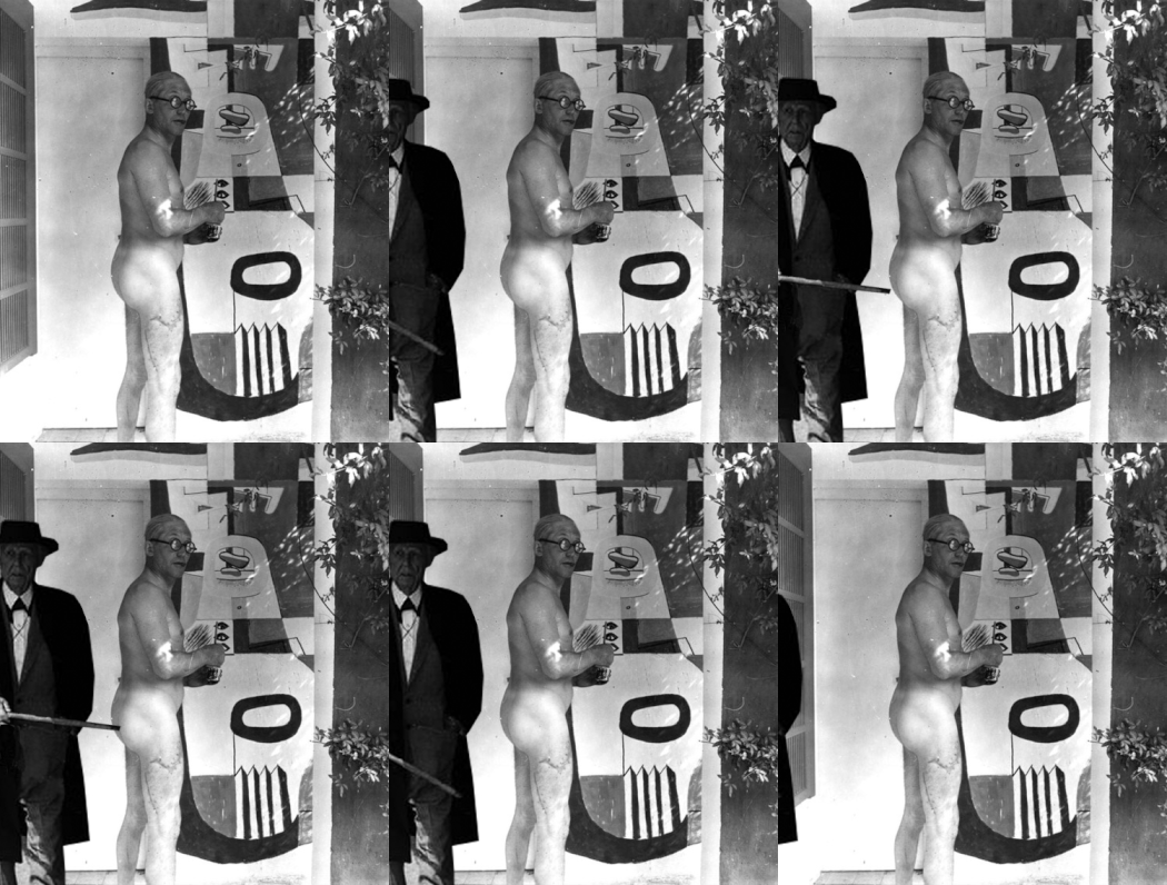
Franked by Emily Fischer, the winner of the Le Cor(nudie)r Competition

Budapest Architecture Film Days
In Slavic languages the word for "palate" is close to the word for "sky" or "heaven". A palace is a home for those of heavenly, sublime, noble origins. The film Palace for the People (2017) shows the fate of the first palaces built for the working class after they've "gone to heaven". In these buildings every little detail from the carpets to the cutleries, from the chandeliers to the porcelains were part of a total design plan.
„Socialist state imagined the federation as a Gesamtkunstwerk, in which the unordered, chaotic life of past ages was to be replaced by a unitary artistic plan.” Boris Groys
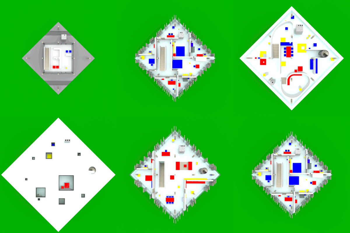

Nathaniel Barlam’s Study of John Hejduk's Diamond House A
In 1962 architect and educator John Hejduk (1929-2000) started a six-year investigation on the architectural implications of the “diamond configuration”: a forty-five-degree rotation of bounding elements relative to an orthogonal system. The exhibition of drawings and models held at The Architectural League in New York in 1967 showed the three projects (Diamond House A, Diamond House B and Diamond Museum C) the architect developed on this matter.
GIF of Diamond House A floor plans in forced perspective.
GIF of Diamond House A's elevations, taken from all 8 cardinal directions.
Delirious by Emily Fischer for
The !!!!!!!!!!!! Competition: Architecture in the Age of OMG
by Reality Cues
No, those are not alligators, but two Empire State buildings in the bed! And what an imperial bed it is!
